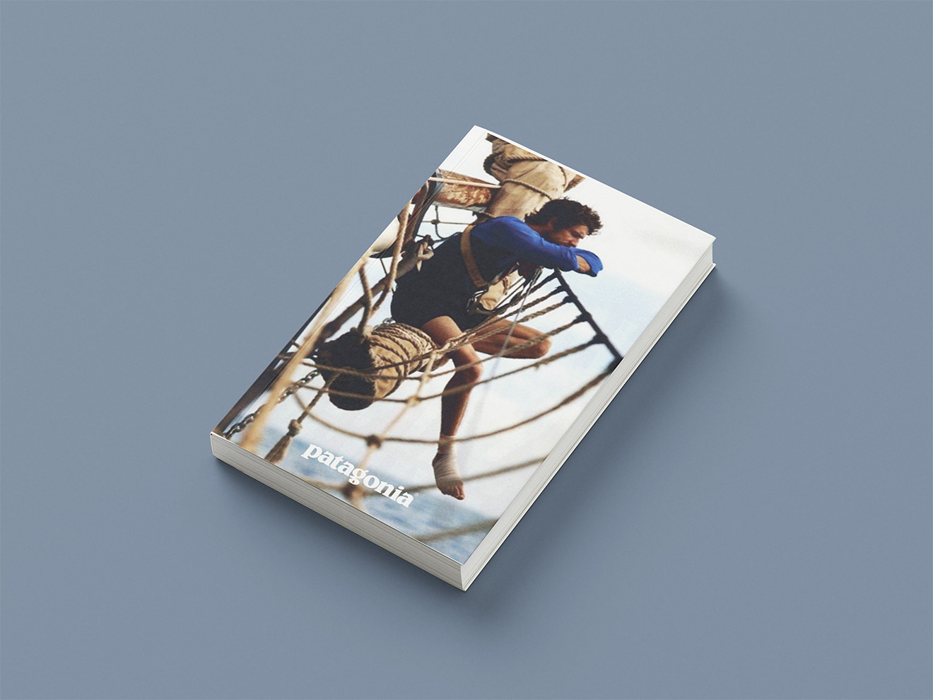
Patagonia Editorial Magazine

STrategic overview
The Brief
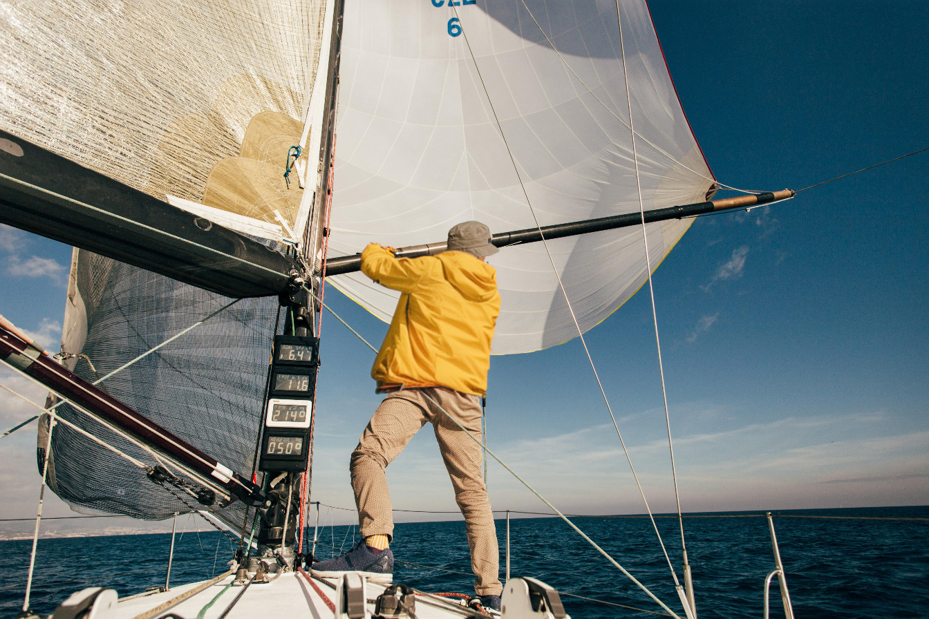
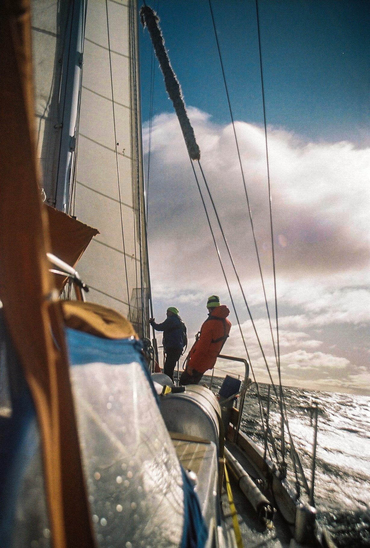
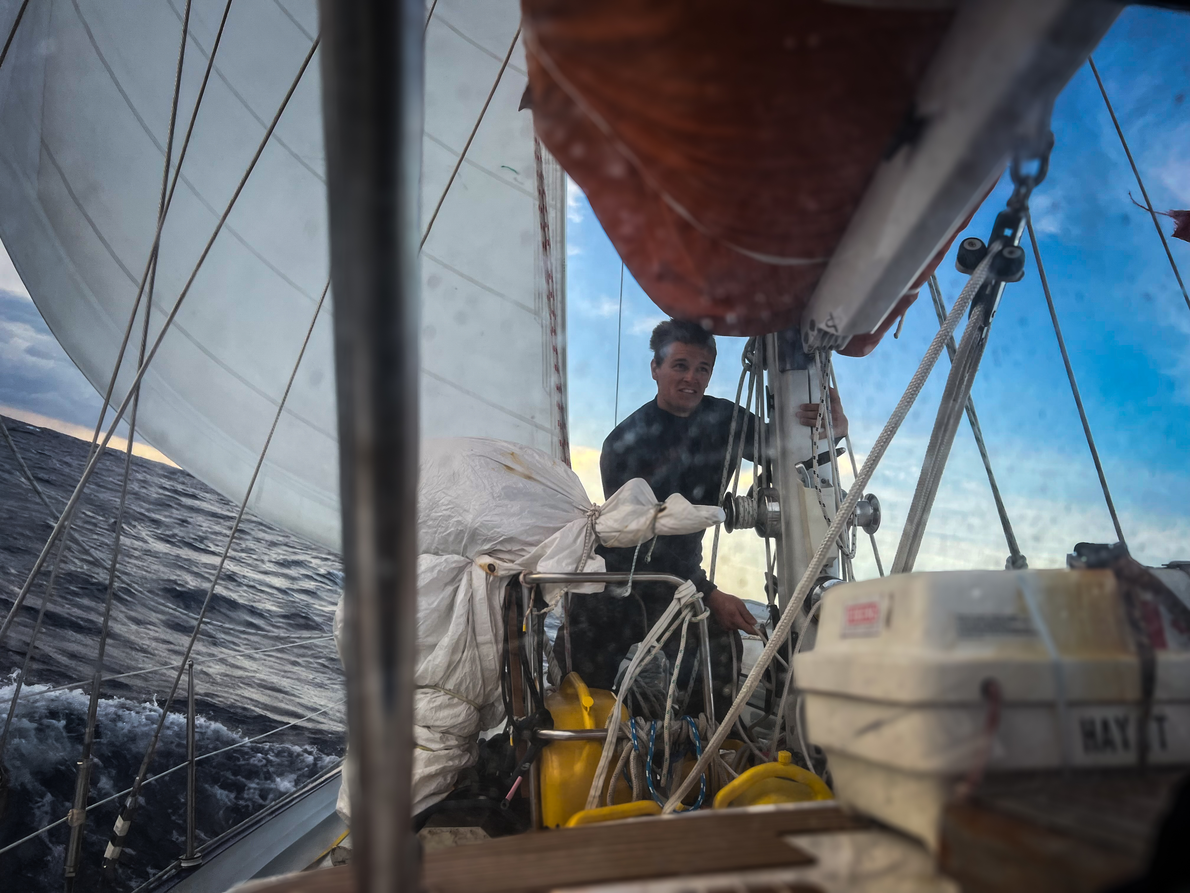
The Patagonia editorial magazine project is a publication design exploration that translates the brand’s environmental mission and storytelling culture into a cohesive editorial format. The project focuses on designing a magazine system that combines long-form narrative, photography, and informational layouts while maintaining a consistent visual language. Emphasis was placed on typographic hierarchy, grid structure, and pacing to ensure the magazine functions as both an informative and immersive reading experience aligned with Patagonia’s values.
- Editorial magazine design translating brand values into publication form
- Focus on storytelling, photography integration, and information layout
- Built using typographic hierarchy, grid systems, and pacing
- Designed as a cohesive, brand-authentic publication system
The Challenge
Brand Problem
The main challenge was to design an editorial system that felt authentic to Patagonia’s identity without relying on overly commercial or polished outdoor aesthetics. The publication needed to balance expressive storytelling with functional readability while maintaining consistency across multiple article types, image treatments, and information structures. Ensuring the layouts supported both emotional narrative and informational clarity was key to making the magazine feel credible as the real brand publication.
- Needed to feel authentic to Patagonia without looking overly commercial
- Balance expressive storytelling with strong readability
- Maintain consistency across different article types and layouts
- Support both emotional narrative and informational clarity
Strategic Solution
My approach centered on developing a flexible editorial framework rooted in typographic hierarchy and modular grid design. I explored image scale, white space, and rhythm to guide reader flow while reinforcing tone and mood. The design process emphasized cohesion across spreads, consistent visual hierarchy, and a restrained palette to let photography and storytelling lead. The final result demonstrates the ability to translate brand values into a structured editorial system that feels both strategic and visually engaging.
- Developed modular grid and structured typographic system
- Used scale, white space, and rhythm to guide reader flow
- Built cohesion across spreads through consistent hierarchy and palette
- Focused on letting imagery and narrative lead the visual tone

